Data from the ARMOR® platform’s dashboard can help outbound teams understand why calls aren't being answered, flag behaviors that put number reputation at risk, and surface patterns that most sales managers would never catch on their own. Whether you're investigating a spam flag, trying to understand which calling windows are working, identifying what a struggling rep is doing differently, or assessing whether your call campaigns are driving engagement or complaints, the dashboard puts the answers in reach. Patterns in call volume, attempt frequency, answer rate by carrier, time of day, day of week, and call duration all tell a story that can help steadily improve both number reputation and answer rates over time. ARMOR® customers also have access to a dedicated Customer Success Manager who can provide expert strategic guidance based on their data.
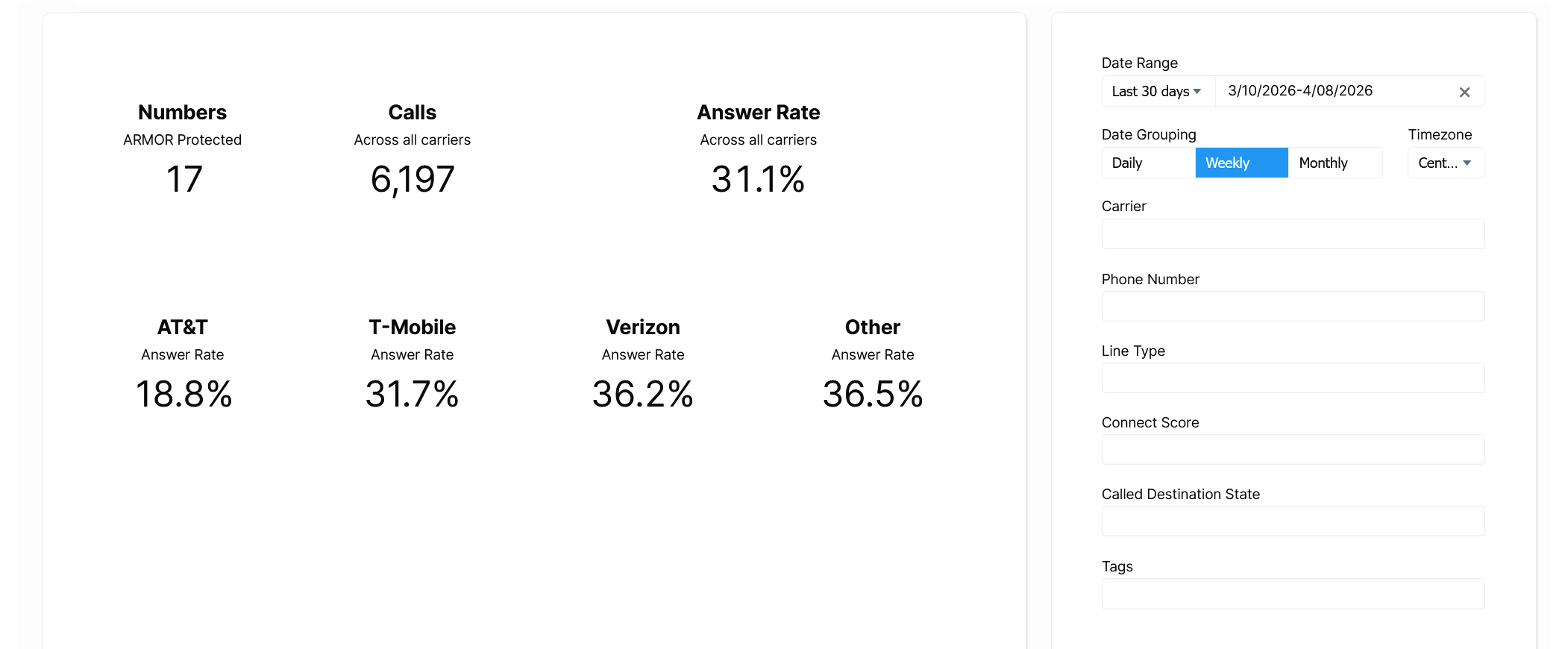
Your ARMOR® dashboard is a window into the performance of your outbound strategy. The ability to filter your answer rate and calling data by carriers, times of day, days of the week, and individual phone numbers can surface many useful and actionable insights.
But data only tells a story if you know how to read it.
This guide walks you through several charts available on the ARMOR® dashboard, along with five example data patterns they can help surface. You’ll learn what those patterns look like, what they typically mean, and what you can do after recognizing them to improve the deliverability of your calls.
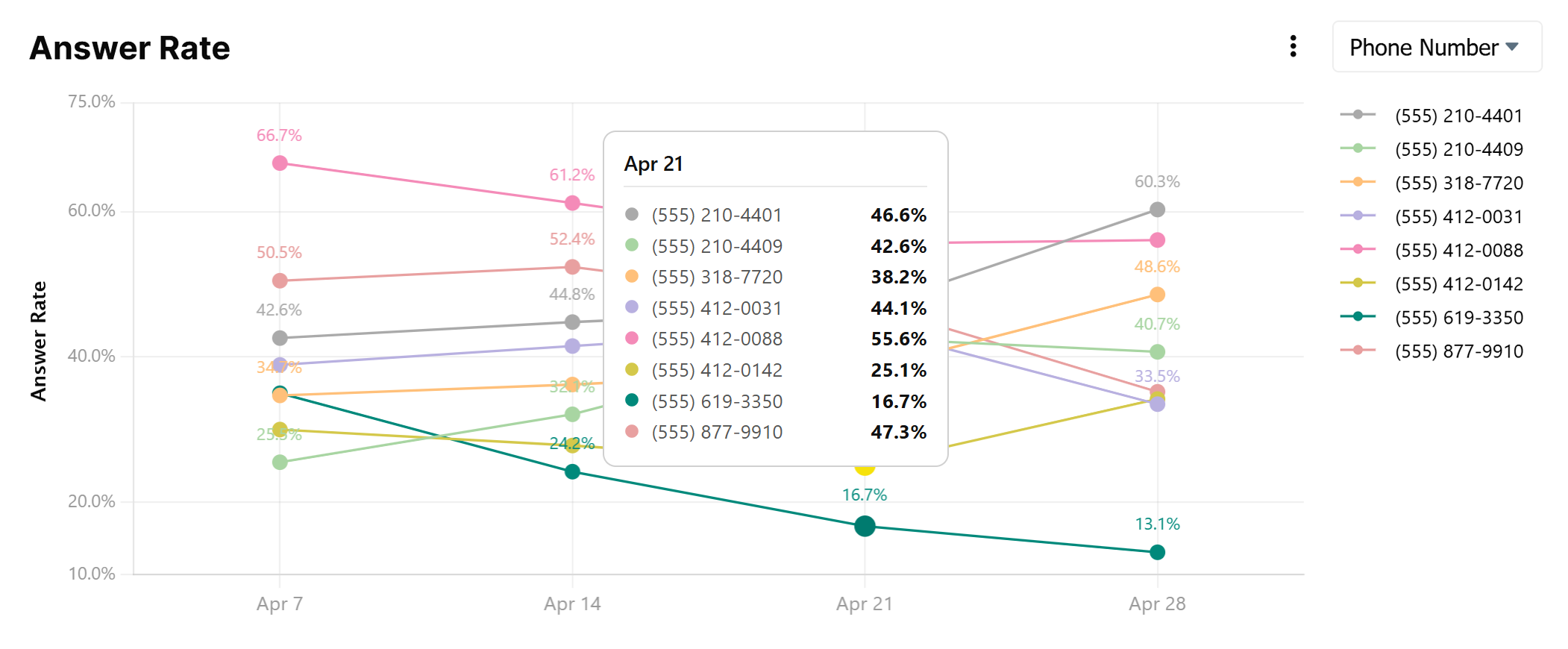
Your overall answer rate is holding steady, but when you filter by Phone Number, one or two numbers show a significantly lower answer rate than the rest of your pool.
Something different is happening on that number, and it's worth finding out what. In teams where each rep owns their own number, this chart becomes a direct window into individual behavior. The outlier rep might be calling too frequently, dialing outside of appropriate hours, or working a list that's been exhausted. They may not even realize it.
In some cases, the pattern can also indicate that the number has been flagged by one or more carriers, particularly if the drop is sudden rather than gradual. But don't assume that's the answer before investigating the behavior behind it.
Related: 27 Factors That Can Drive Up Your Spam Flag Risk & How the ARMOR® Platform Helps Protect You
Your top-level answer rate looks reasonable, but when you look at the carrier breakdown, you see a large gap. For example, one major carrier may be performing significantly below the others.
Different carriers use different spam-scoring algorithms and label calls independently. A gap like this can signal that multiple numbers you use have been flagged by one carrier in particular.
Related: Best Practices to Prevent Your Calls From Being Flagged
What makes the carrier filter particularly powerful is that it can help build a data-driven case when a flag doesn't seem warranted. Within a carrier, for example, you might note that some numbers exhibiting similar call patterns are unflagged, suggesting that the flags may be unwarranted. Or, across carriers, you can show the impacted carrier that these same signals are not resulting in flags on the other carriers, again potentially supporting the case for remediation. Either way, this data is available to the ARMOR® team to take directly to the carrier when making the case for remediation.
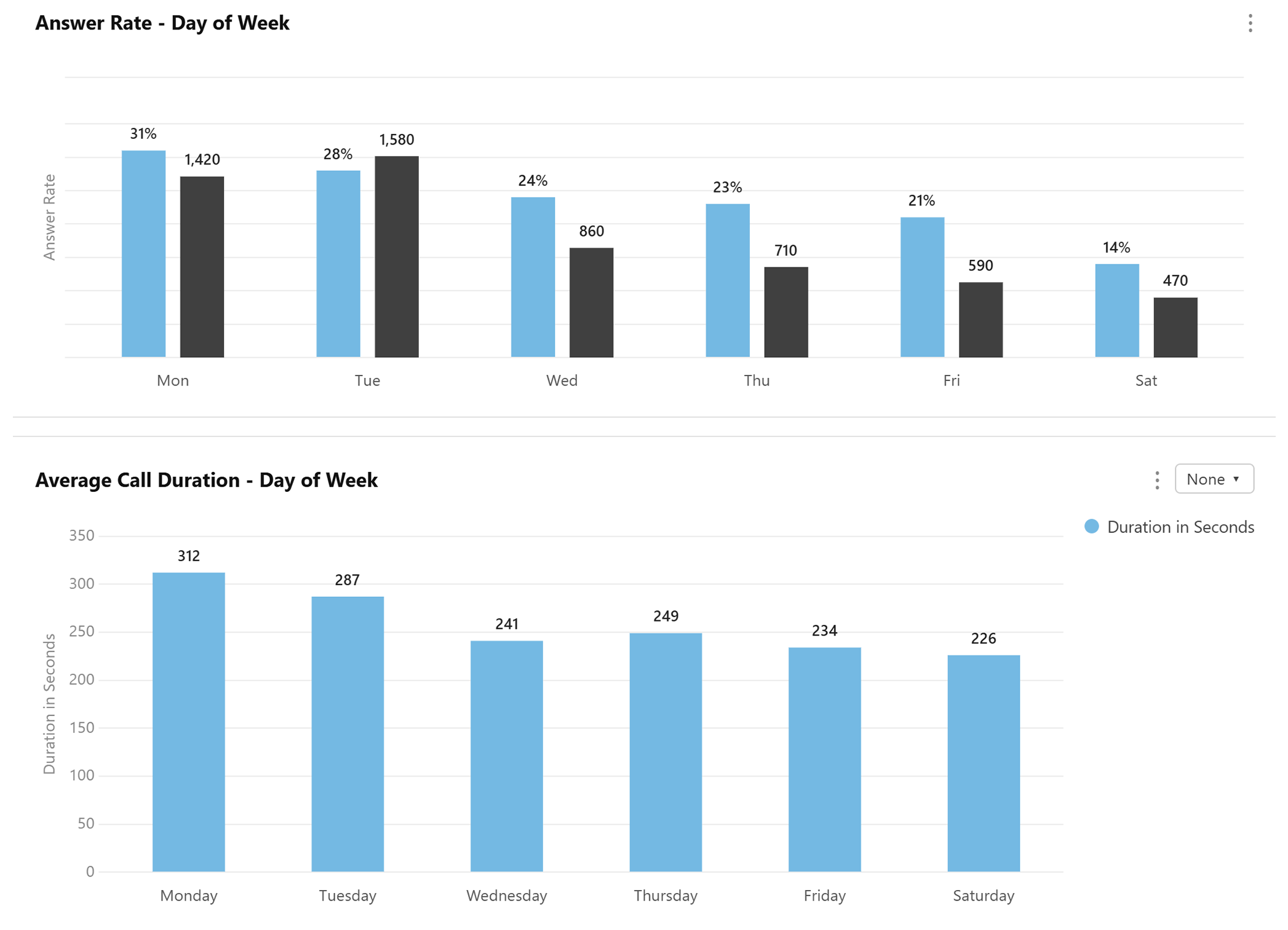
There are all kinds of interesting patterns you can detect related to call timing. For example, you might find that answer rates on Monday (31%) and Tuesday (28%) are higher than later in the week (24% to 14%). You might notice that call duration drops sharply in the morning, suggesting contacts are picking up but disengaging quickly. Or you might discover something more immediate: calls being made at hours that are not recommended, or allowed.
Call volume, answer rates, and call duration by time of day and day of week highlight the optimal and suboptimal calling windows. Adjusting call strategy to overlap with the days and times that generate the most positive results is a meaningful opportunity to improve campaign performance.
Conversely, patterns that show less or a lack of engagement are meaningful too, pinpointing call windows that are less productive at best, and more likely to result in spam flags at worst. Volume without engagement is a core problem here. Carriers look at when you call as one signal among many, and calls placed at low-engagement windows (or outside of appropriate hours entirely) compound reputation risk over time.
The data can also surface something more immediate. Reps making calls at 6 AM, late at night, or outside of sanctioned windows often go undetected without visibility into the data. Managers are frequently surprised when it comes to light. This is both a carrier risk and a potential compliance issue depending on the states you are calling into.
One important nuance: volume on weekends or off-peak days is not inherently a problem. If your business model calls for weekend contact and your engagement signals are strong, the data will reflect that. What draws carrier attention is volume in the absence of engagement, regardless of the day.
Note: You can filter by individual number or groups of numbers to identify optimal call times for specific reps or teams on your team as well.
What It Looks Like
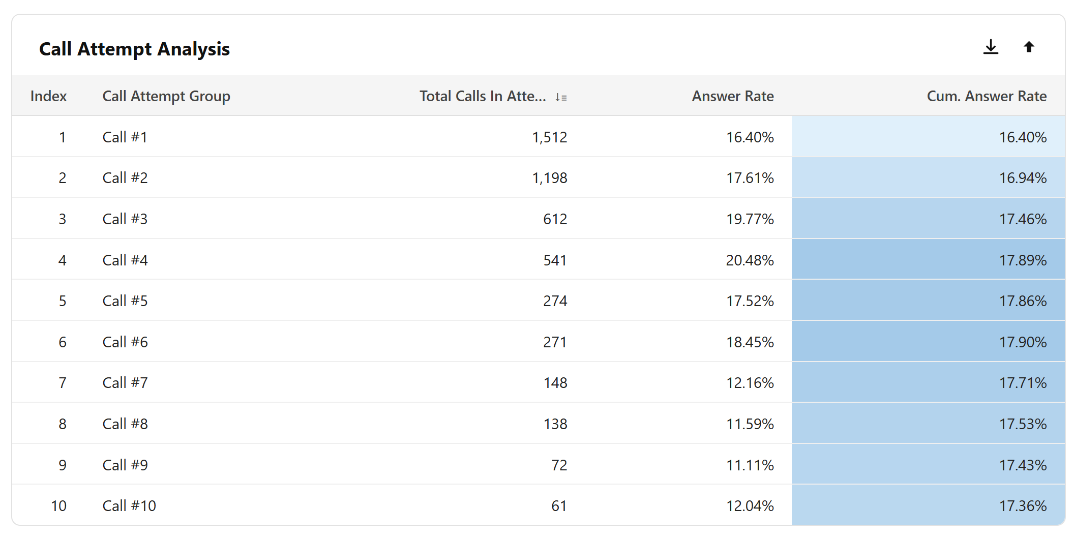
The Call Attempt Analysis chart shows how many times unique contacts are being called within a given day or time period, along with the answer rate and cumulative answer rate for each attempt group. At a glance, you can see how many contacts received a first call, a second, a third, and so on, all the way out to contacts called 5, 10, 25 or more times.
Critically, this chart captures the recipient's experience across your entire number pool. Carriers know when multiple numbers belong to the same business, so calling the same contact from different numbers doesn't reduce exposure. It just makes the problem harder to see without this data.
The Call-to-Contact Ratio looks at this from the caller's perspective, at the phone number level. It divides the total calls a given number made by the unique contacts it contacted. This is useful for spotting over-persistence at a number level, but can be misleading on its own if your team is rotating through multiple numbers to reach the same contacts, which is exactly what the Call Attempt Analysis is designed to catch.
Depending on the time period and frequency, calling contacts too many times can be seen by carriers as overly persistent and a signal of nuisance calling, particularly when engagement doesn't support it. The answer rate column shows how each attempt group is performing, while the cumulative answer rate tells the broader story. Once a cumulative answer rate plateaus, continued outreach leads to diminishing returns with compounding reputational risk.
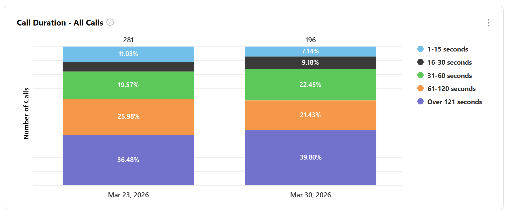
The Call Duration - All Calls chart breaks down your entire call volume across six duration buckets, from 0 seconds all the way up to over 121 seconds. At a glance, you can see what proportion of your total calling activity is generating real engagement versus ending almost immediately.
Significant volume in the 60-120 and 121+ buckets shows strong engagement. However, If the majority of your volume is sitting in the shorter buckets, most of your calls are either not being answered or are being cut short, and that lack of engagement is visible to carriers too.
Short call durations across a high proportion of your volume are a signal that something isn't working. Contacts may not be answering at all, or they may be picking up and disengaging almost immediately, neither of which reflects well on number reputation. Carriers look at duration as one indicator of whether calls are generating genuine engagement or simply burning through contacts.
The inverse is equally telling. A healthy duration distribution, with a meaningful share of calls landing in the longer buckets, suggests that contacts who do engage are having real conversations. That is a positive signal for number reputation, and in cases where flags have been applied, strong duration data can support the case the ARMOR® team makes with carriers during remediation.
One important caveat: the accuracy of duration data depends on how your call data is being sent to the ARMOR® platform. For customers sending CDR data, duration figures may include ring time alongside talk time, which can affect accuracy. Treat duration as a directional signal rather than a precise measurement, and consult your ARMOR® Customer Success Manager if you are unsure how your data is being captured.
Related: Call Reputation Management Services: Are They Worth It?
The ARMOR® platform collects and displays data in different ways depending on your setup. Customers using SIP/probe integration receive the most precise answer rate and call duration data, as the platform can identify with certainty whether a call was answered and how long the conversation lasted.
For customers providing CDR data, where clear answered call data is not available, the ARMOR® team will work with you to establish a call duration threshold that serves as a reasonable proxy for an answered call, factoring in variables like ring time. This is discussed during onboarding to ensure the proxy is calibrated appropriately for your business. Figures derived this way are estimates, and our team can help provide context when interpreting them.
Regardless of setup, the data available through the ARMOR® dashboard provides valuable visibility into your calling patterns, number performance, and engagement quality. It also supports the most comprehensive, data-backed remediation available when flags need to be challenged with carriers. This is a powerful advantage that can have a dramatic impact on number reputation, call deliverability, and ultimately, results.
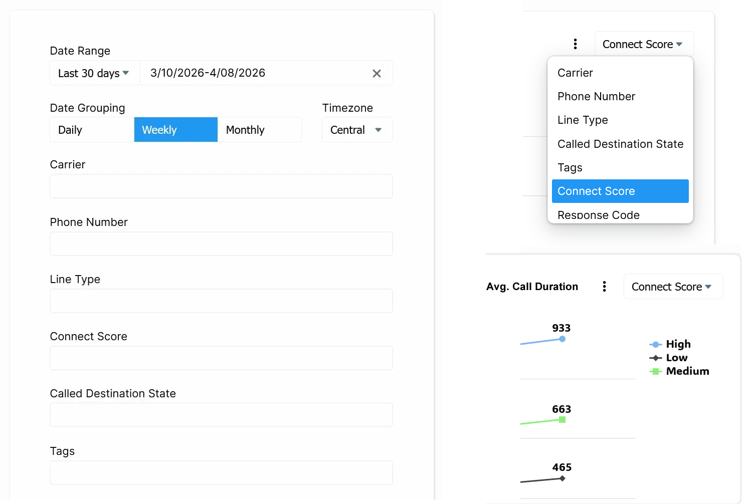
The dashboard's filter panel lets you slice all of your data simultaneously across every chart. You can filter by date range, one or more phone numbers, carrier, line type, Connect Score, a lead quality and engagement metric that can help identify low-activity contacts worth deprioritizing, Called Destination State, and custom tags your team has applied to organize your numbers.
Many individual charts also allow you to pivot the data within the chart itself, letting you compare results across carriers, phone numbers, line types, and more without leaving the view.
Note for Protect customers: Dashboard analytics are available with ProtectPlus and ProtectMax plans. If you're on the Protect (ARMOR® Lite) plan and don't see data in your dashboard, upgrading your plan will unlock these insights.
The signals in your ARMOR® dashboard are not just useful analytic, they are a window into how carriers are evaluating your numbers in real time. Call volume, attempt frequency, engagement quality, time of day, these are the same factors carriers weigh when deciding whether your calls get through or get flagged. Having visibility into that data puts your team in a position to make smarter decisions, catch problems early, and build calling habits that hold up over time.
With the ARMOR® team behind it, you are not just safeguarding your numbers. You are gaining a partner who can turn that data into action, identifying issues, making the case with carriers on your behalf, and helping your outbound operation perform at its best.